
ASK: Which experiments should I run?
Published:
5 minute read
Despite not knowing anything about your research, I can still give you some advice on how to design your experiments.
Make a mock-up
At the start of a research project, in the second week or so, I ask my students to do the following:
Grab a pen and paper. Sketch out the most important figure that you will create. Which figure will you use to communicate your main contribution/finding/take-home message to me?
The idea is that this will help them think about what things they can measure, and what things they should measure to answer their research questions. This should give some direction for them, because it allows them to work back from that final figure. They can, and likely should, also have other figures to communicate a more nuanced story.
This is actually where my advice originates. When I was trying to decide on the experimental design for this paper, prof. dr. Kuldeep Meel once told me to envision the final figures and do what was necessary to get them.
Stick to the rules
I also encourage them to annotate their mock-ups with the meaning of certain findings. In fact, there are a couple of rules:
- Use pen and paper. Don’t waste time with fancy plotting tools until you have concrete data to plot.
- Do not write any numbers. You don’t want people to mistake your mock-up for actual findings.
- Stay open-minded. The point of science is not to prove your point. It is to find the truth. Commit to what you will measure, not to your desired outcome.
Example
Here is an example of what I expect from this exercise. It is based on one my favourite visualisations of research findings, which I was introduced to by prof. dr. Siegfried Nijssen1:
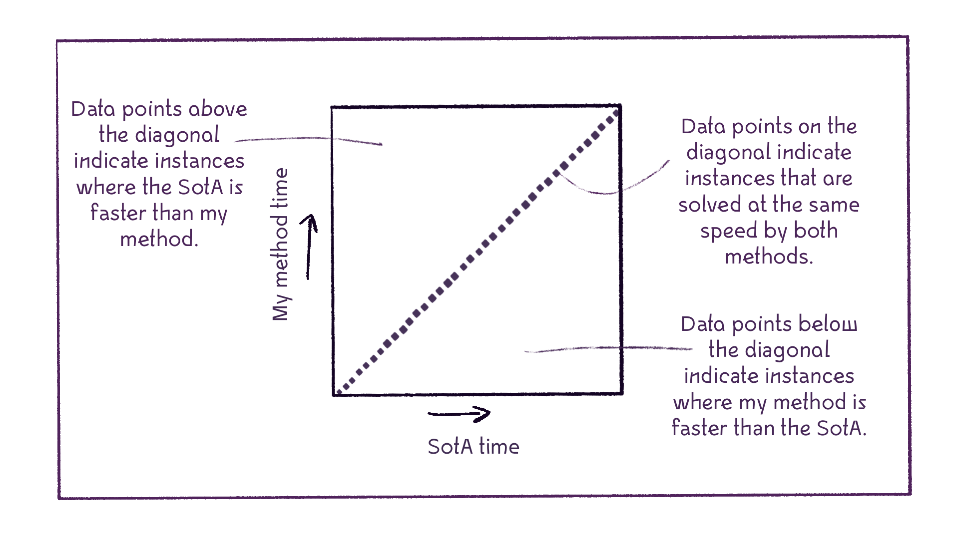
In this plot, I am imagining a scatter plot, where each data point corresponds to a problem instance. The horizontal axis represents how much time the SotA (State of the Art) needs to solve that instance. The vertical axis represents how much time my method needs to solve that instance. I have annotated different areas in the plot with their interpretation. Any data point below the diagonal means that my method solved the corresponding instance faster than the SotA. Any data point above the diagonal means the opposite. Data points on the diagonal indicate instances for which both methods performed the same.
Now what?
I ask my students to make a sketch like the above at the start of their projects. Once they have decided on what their most important plot is going to be, they can start making a script that takes their raw data as input and returns a plot that looks like their sketch. Because they have already shown me what figure to expect, and what the meaning of the shape of the figure is, they can then quickly update me on their progress. They can even use it as a placeholder figure in their paper drafts or presentations.
Obviously, everybody’s research is different, and the plot above may not work for your research. My advice: sit down and think about:
- what you are researching
- what the most important research question is
- what you need to show to answer that question, and thus
- what you need to measure, so you have data to plot.
If you don’t know, read the literature to see how other scientists in your field use plots communicate their findings. Kick ass!
Inspiration
I am not the only one who does this! The following examples were kindly shared with me by Tom Stafford and Daniela Gawehns (posted here with their permission):
| Credit: Tom Stafford. | Credit: Daniela Gawehns. |
|---|---|
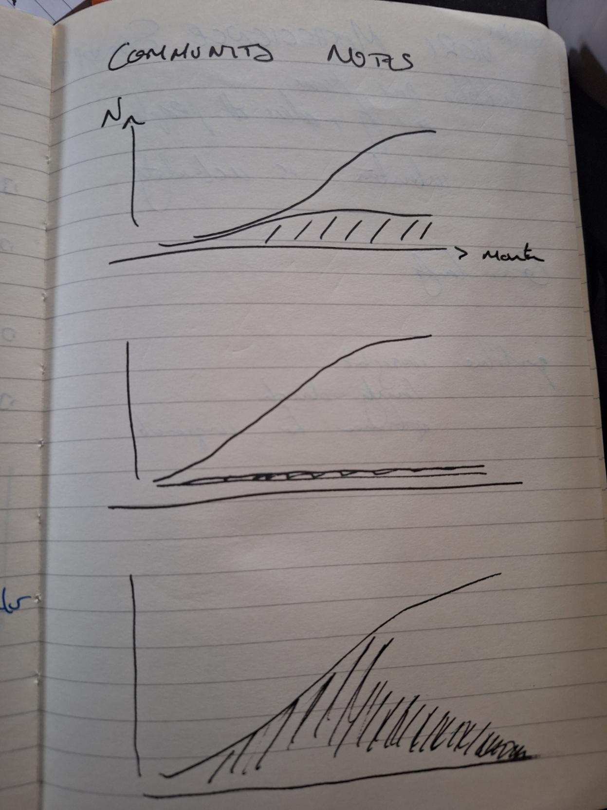 | 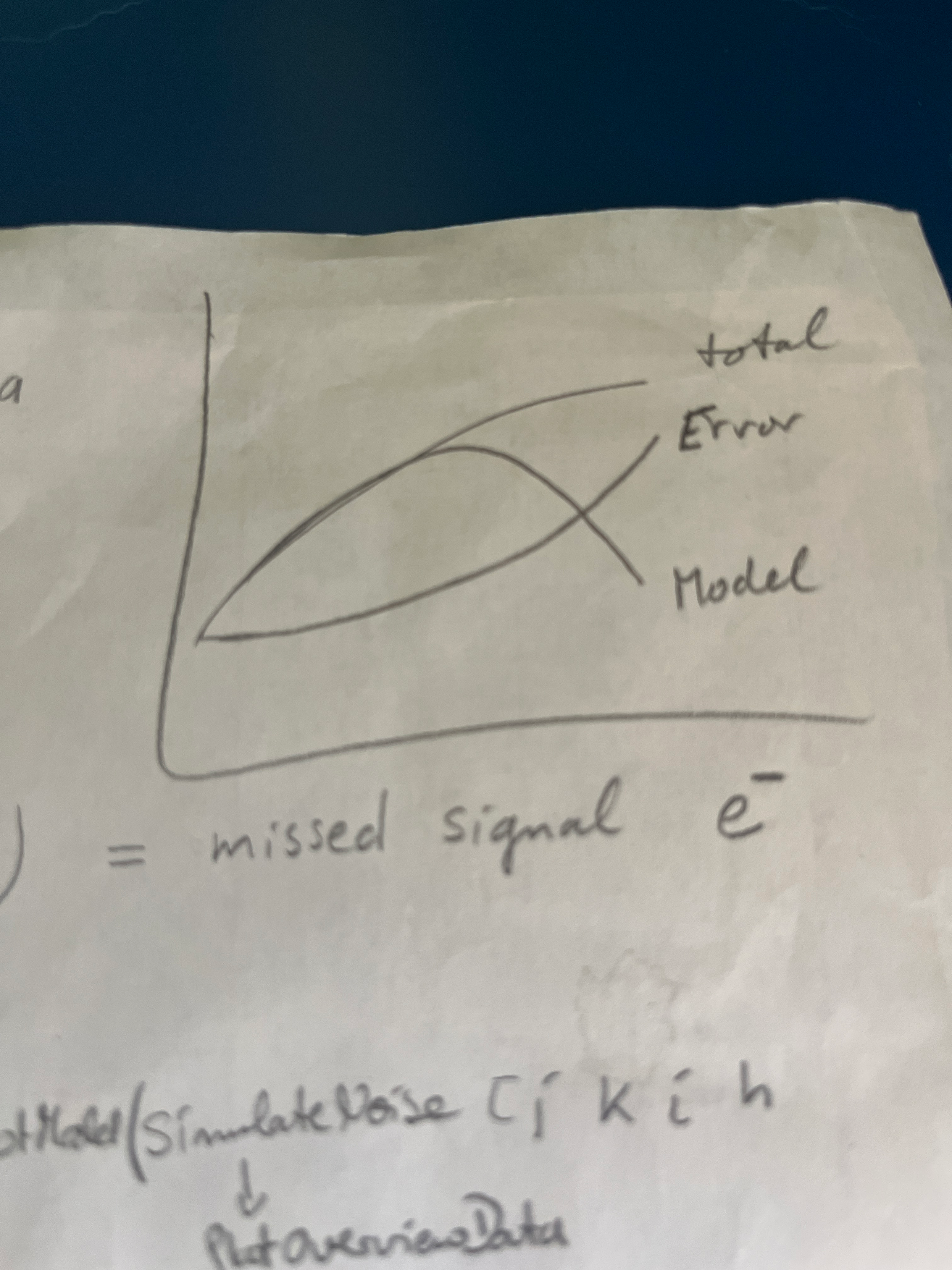 |
| Possible outcomes for an analysis of Community Notes contributors. | Interpreting potential findings. |
I really love the following slides by prof. dr. Thomas Gärtner. They immediately grabbed my attention at the start of his talk, and communicated to me what I should pay attention to and how to interpret the material that he was going to present during the rest of his talk (posted here with his permission):
 |
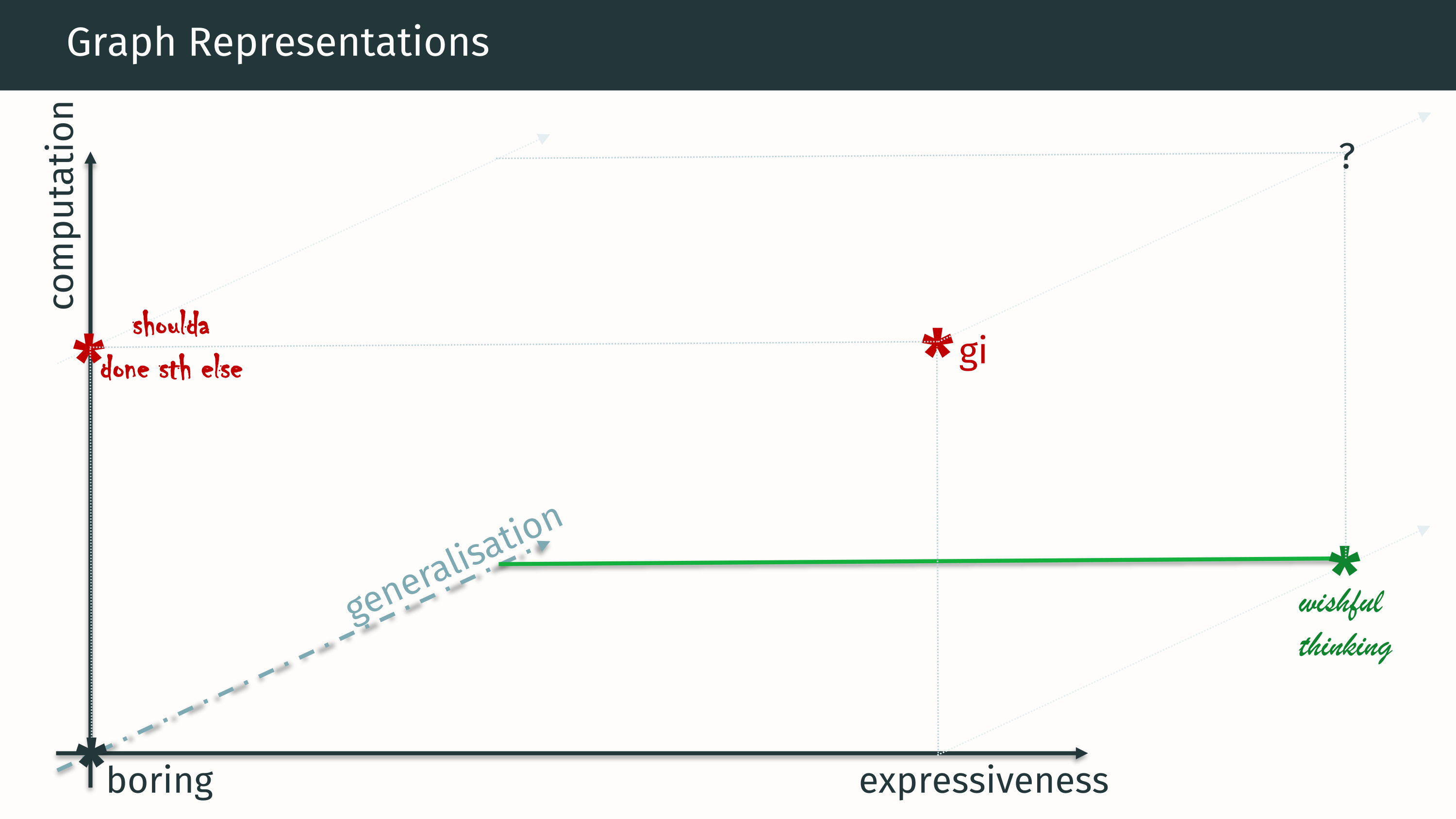 |
Thanks for sharing!
Call for submissions
What is your favourite plot to communicate your main findings? Do you have any sketches that you are willing to share, so I can post them here to help others? Please get in touch!
This post is part of ASK, the Academic Survival Kit. Please click here for a list of all posts in this series.
Footnotes
Fun fact: when my former student Daniël once came across a picture of me presenting a poster at a conference, he immediately spotted a figure like this on my poster and went “I don’t know what this is about, but knowing you, I can congratulate you on these results.” That’s how much I like this kind of plot, and that’s how much he was trained to immediately recognise it as a consequence. ↩